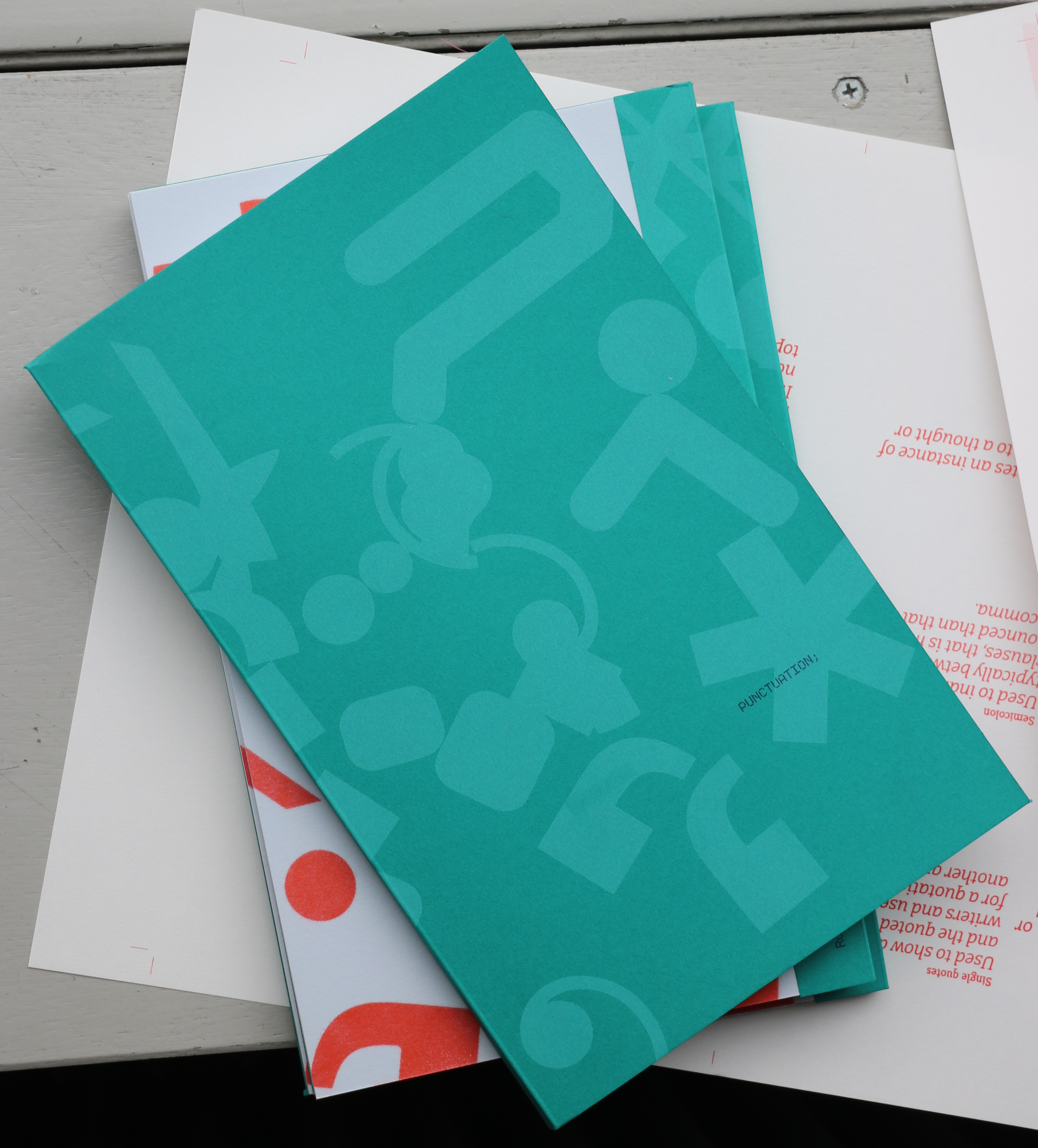
As part of our graduation, Sophie van der Sman and I together worked on the third edition of an annual riso printed publication named
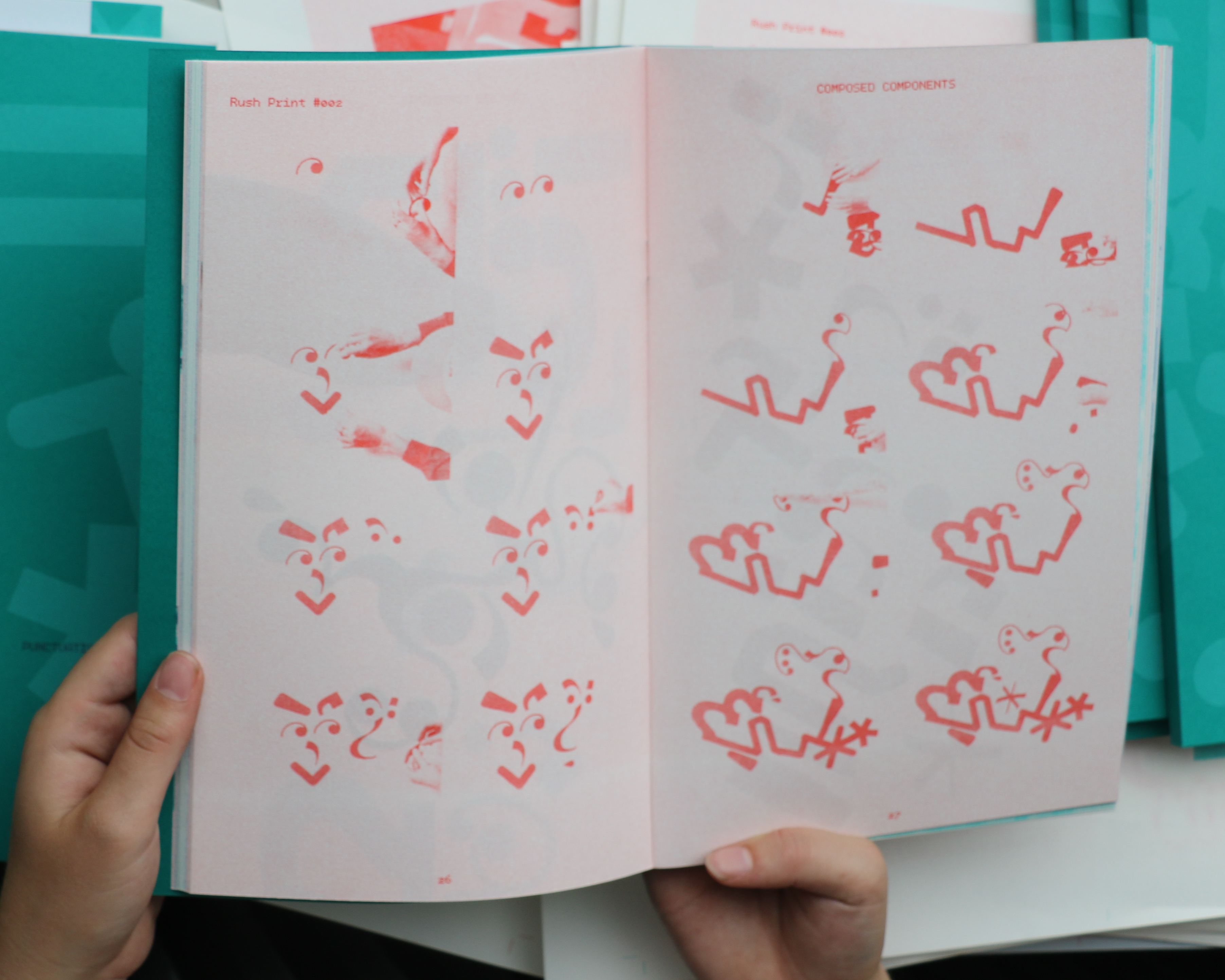
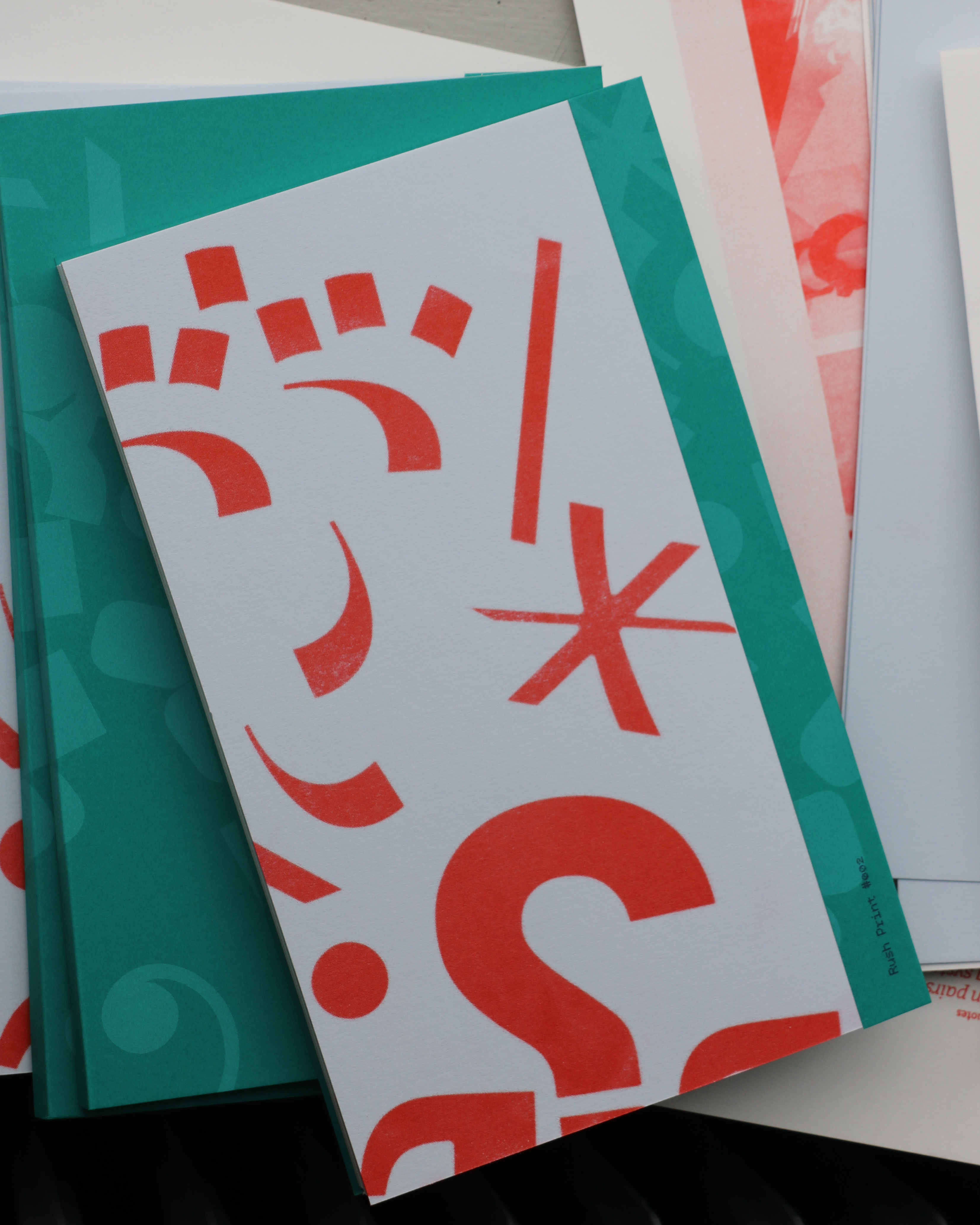
Rush Print. Rush Print #002 lays its focus on a specific part of typography namely; punctuation. Our main
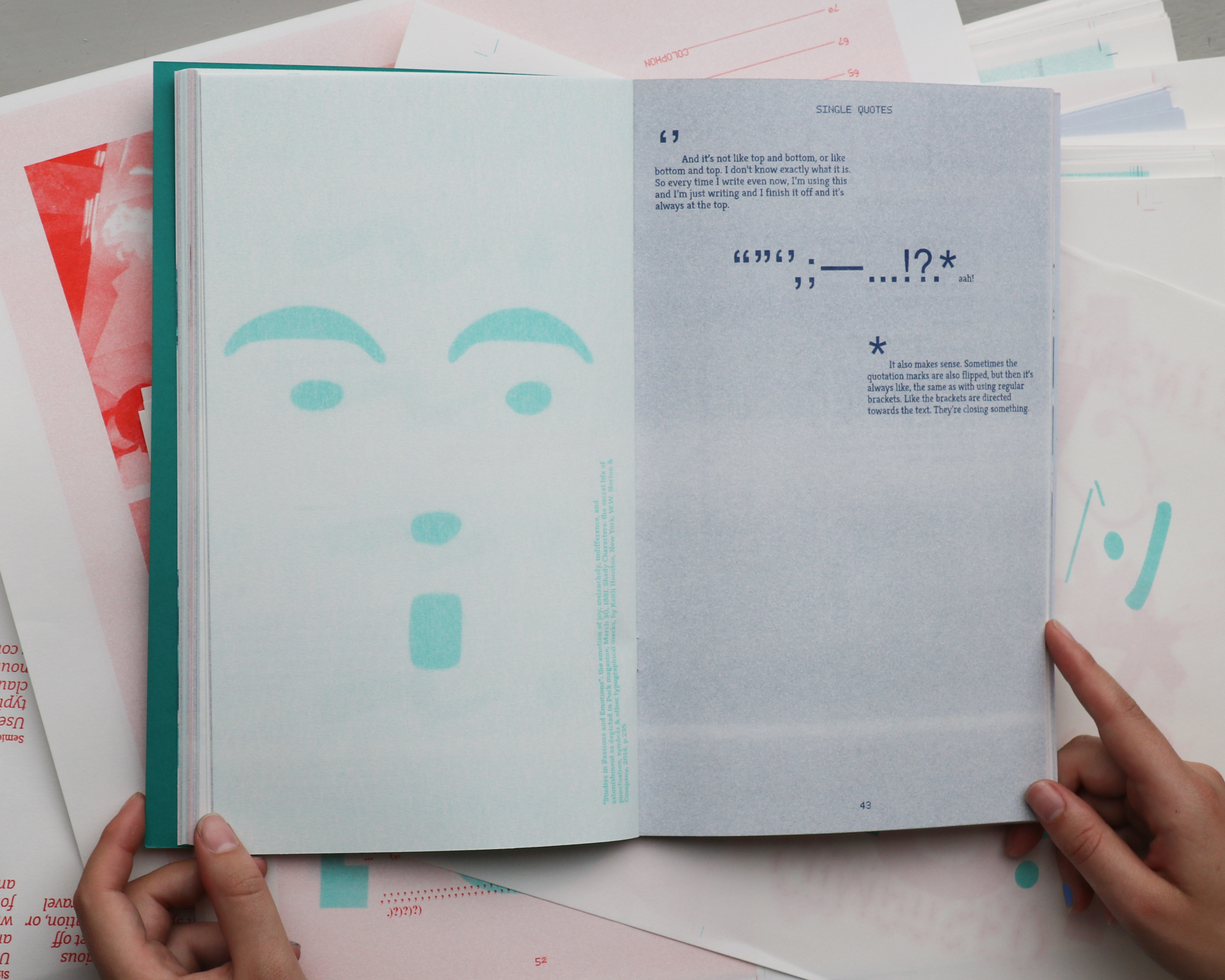
interest in these typographic devices is that they, like typefaces, have the ability to give character to text. Its
typographic shapes are significant and essential for text-based communication, having the power to emphasise
pauses, thoughts, ideas, and even the tone and emotion of a text. Rush Print #002 Punctuation; can be found in
multiple art book shops across The Netherlands.
This publication has been realized in collaboration with Sophie van der Sman.